UX Case Study · E-Commerce Redesign
Ghazal Mojtahedi
Toronto Cupcake — E-Commerce Usability Redesign
Improving affordances, signifiers & mapping for a cupcake shop's online store
A website redesign for a cupcake shop focused on improving product browsing, visual clarity, and checkout flow through clearer affordances, better signifiers, and improved mapping.
Skills Demonstrated
Problem Statement
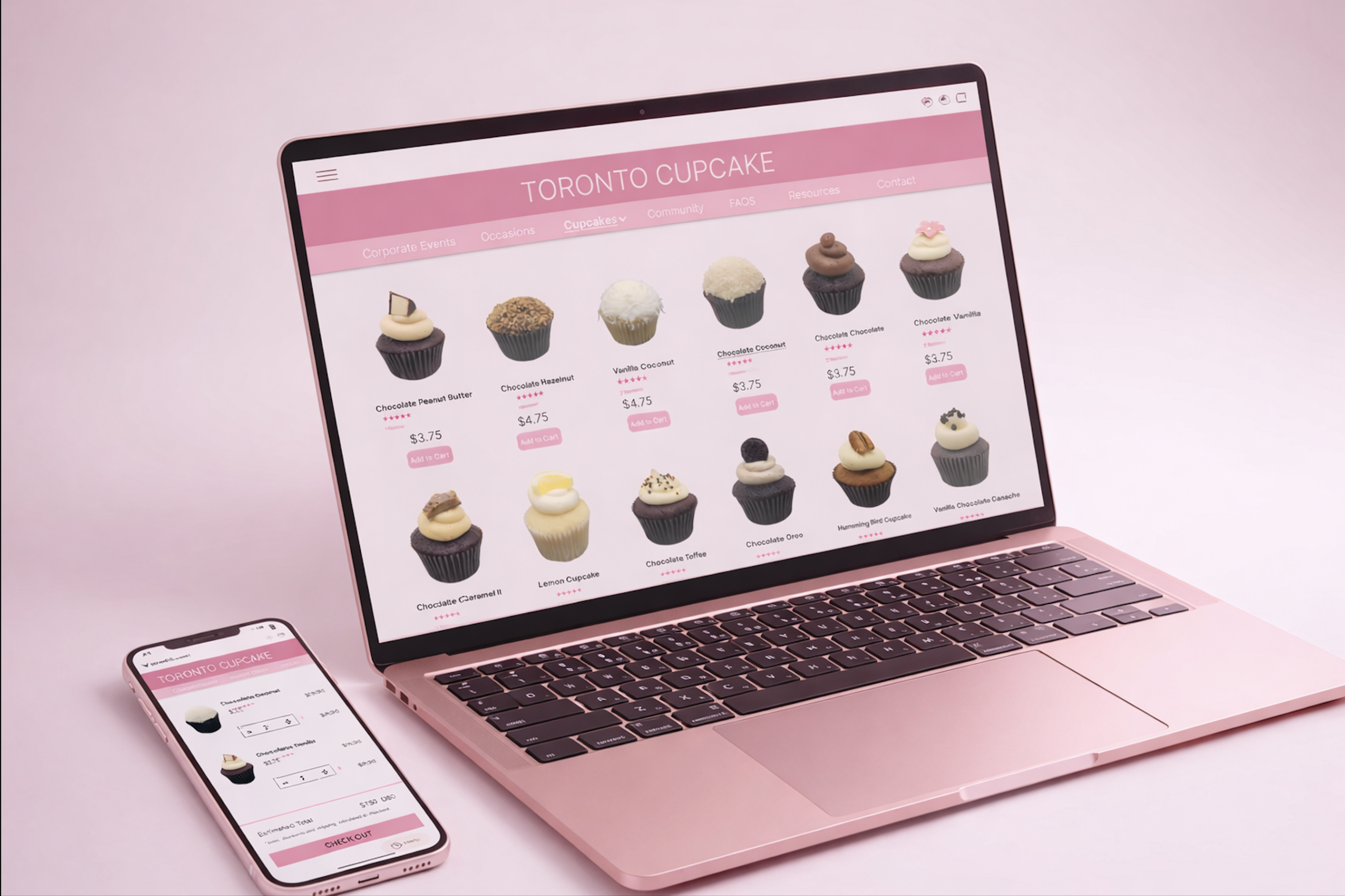
Toronto Cupcake's original site disrupted the shopping experience
Toronto Cupcake is a product-heavy e-commerce website with a wide variety of items, but the original design lacked clarity, structure, and an intuitive shopping flow. Products were presented without clear organization or guidance, key actions were not properly signified, and the navigation disrupted the shopping flow — making it difficult for users to browse, understand interactions, and complete purchases efficiently.
Design Process
Analyzing problems through design principles
Analyze
Identified usability issues based on design principles including affordance, signifiers, and mapping from Norman's Design of Everyday Things framework.
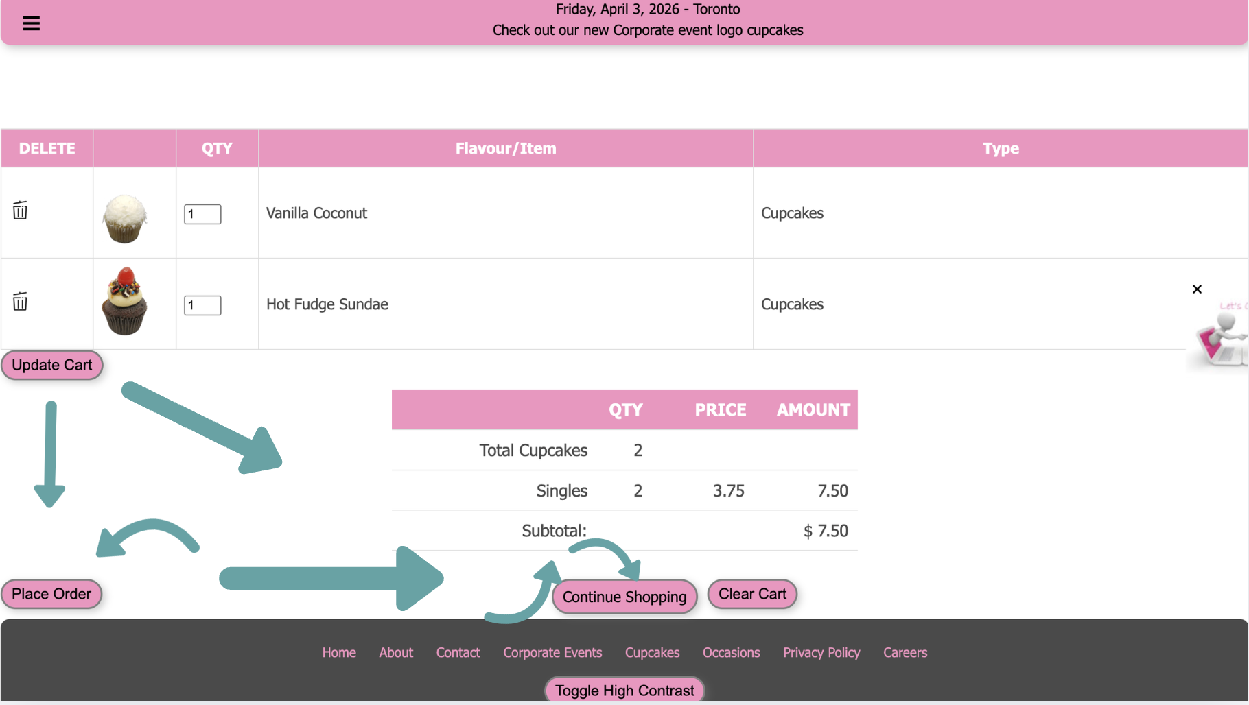
Wireframe
Created low-fidelity wireframes to restructure the layout and improve interaction flow, focusing on navigation placement and cart interaction patterns.
Prototype
Refined wireframes into high-fidelity designs with a clearer grid system, improved navigation, and more intuitive interaction patterns including a pop-up cart system.
Evaluate
Reviewed designs against the original issues to ensure each redesign decision directly addressed the identified affordance, signifier, and mapping problems.
UX Issues & Solutions
Three core design problems identified
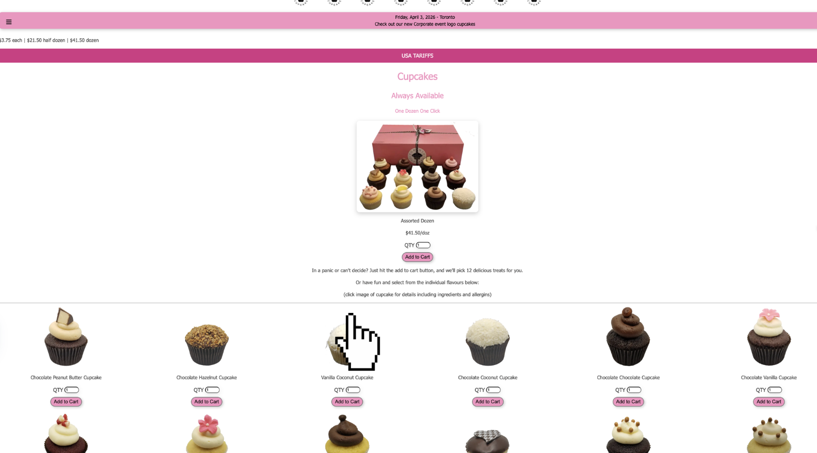
Misleading zoom interaction on product images
On the corporate events page, hovering over images shows a magnifying icon suggesting zoom is possible — but clicking does nothing. The interface implies an action that doesn't exist, creating confusion when the expected interaction fails.
Solution → Enabled a working zoom feature so the perceived action matches actual functionality.
No visual cues for quantity adjustment in cart
The checkout page allowed quantity editing but had no "+/–" buttons or instructions. Although the affordance existed, it wasn't properly signified — users couldn't immediately understand how to change quantities.
Solution → Redesigned cart as a pop-up with clear "+/–" buttons next to each item for intuitive quantity control.
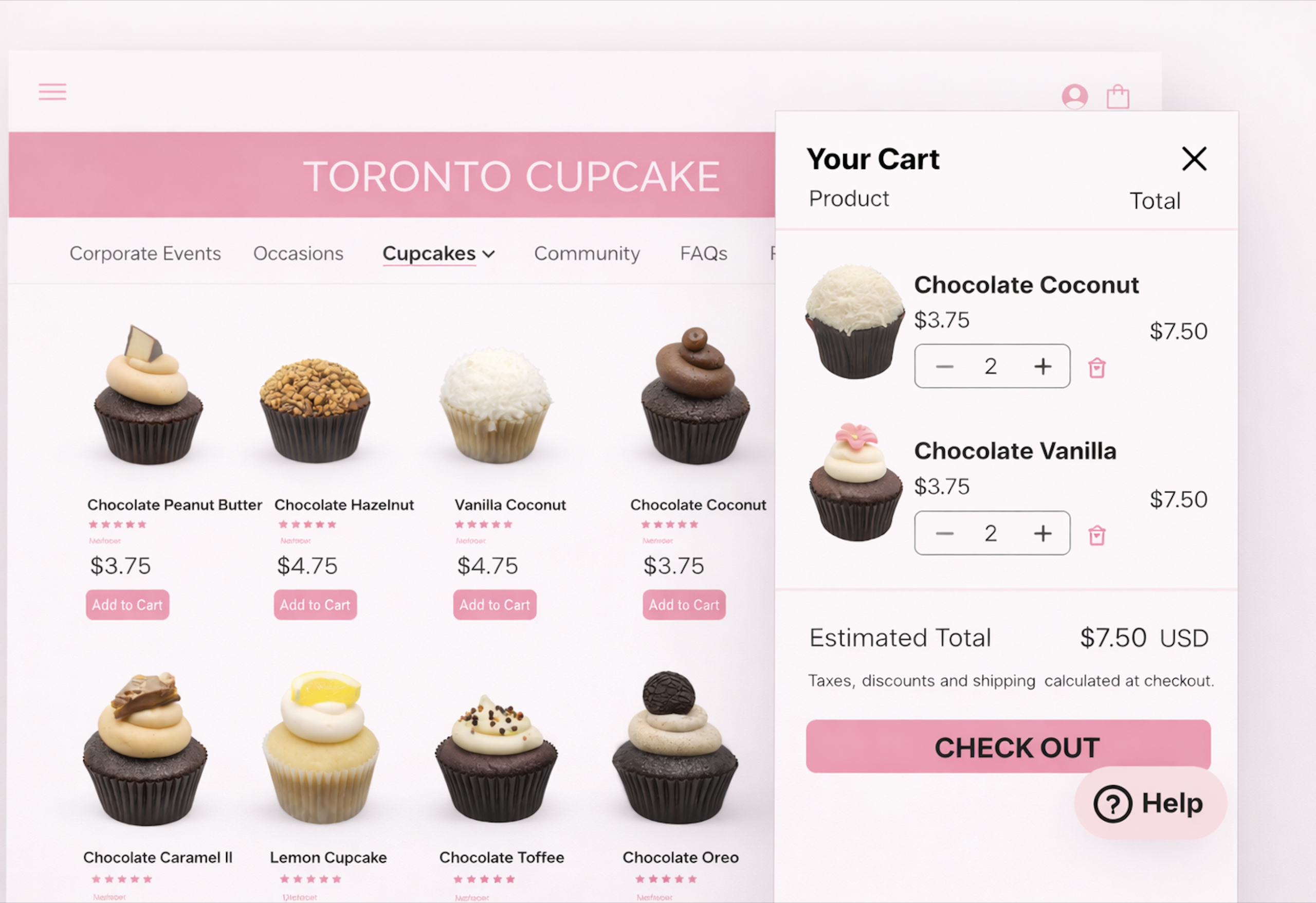
Add to Cart redirects users away from browsing
Clicking "Add to Cart" immediately redirected users to the checkout page instead of keeping them on the product page. This disrupted browsing flow and didn't match user expectations of staying on the page.
Solution → Users now stay on the page and a side pop-up cart appears with immediate feedback, quantity controls, and clear next steps.
Final Outcome
A clearer, more intuitive shopping experience
Working zoom
Product images now zoom as expected, matching the visual affordance the interface signals
Pop-up cart
Side cart appears on the same page with clear quantity controls and a single Checkout button
Uninterrupted browsing
Users stay on the product page after adding to cart — no more forced redirects to checkout
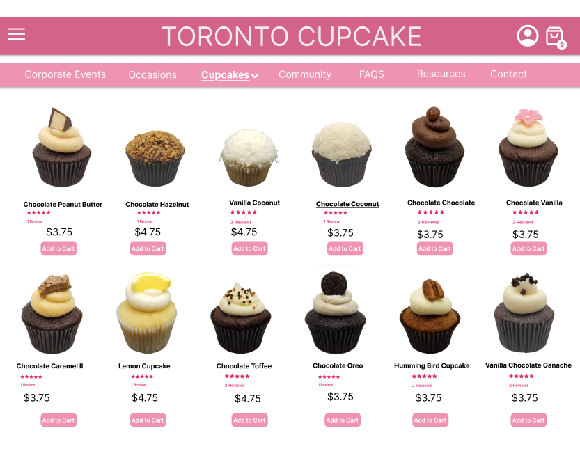
Clearer grid
Structured product grid with consistent spacing, better hierarchy, and improved pricing visibility
Top navigation
Menu moved to top with cart icon in top-right, matching standard e-commerce conventions
Accessibility note
High Contrast toggle moved to a visible position — not buried at the bottom on a low-contrast pink background
Reflection
What I took away
Affordance and signifiers must work together — an action that exists but isn't clearly communicated is just as problematic as one that doesn't exist at all.
Mapping matters deeply in e-commerce — users expect to stay on the page when adding to cart. Disrupting that flow loses customers at a critical moment.
Accessibility features are only useful if they're actually findable — placing the High Contrast toggle in an inaccessible location defeats its entire purpose.
Norman's framework gave me a structured lens to analyze and articulate design problems clearly — turning vague "it feels off" observations into specific, actionable redesign decisions.