UX Case Study · Interaction Design
Ghazal Mojtahedi
Redesigning Microsoft Copilot
for College Students
A UX redesign project focused on improving affordances, feedback, and feature discoverability for student users.
Skills Demonstrated
Problem Statement
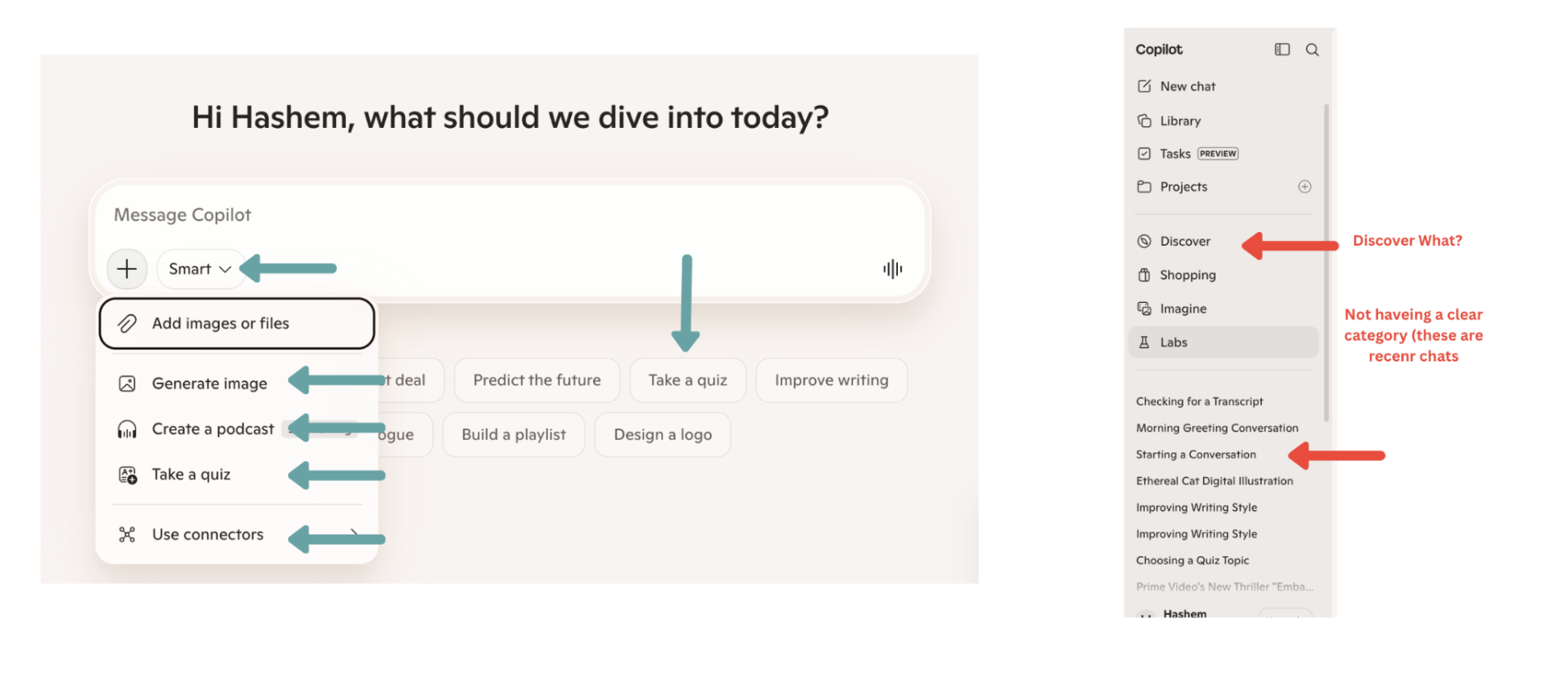
Microsoft Copilot falls short for students
College students need an AI tool that genuinely supports learning — not one that buries features, gives ambiguous feedback, and confuses basic actions. Copilot's misleading icons, hidden voice input, and generic menus meant students only ever used the basic chat, missing capabilities that could have helped them research, write, and study more effectively.
Design Process
From empathy to prototype in two sprints
Empathize
Explored Copilot as active users and compared it to ChatGPT and Gemini.
Define
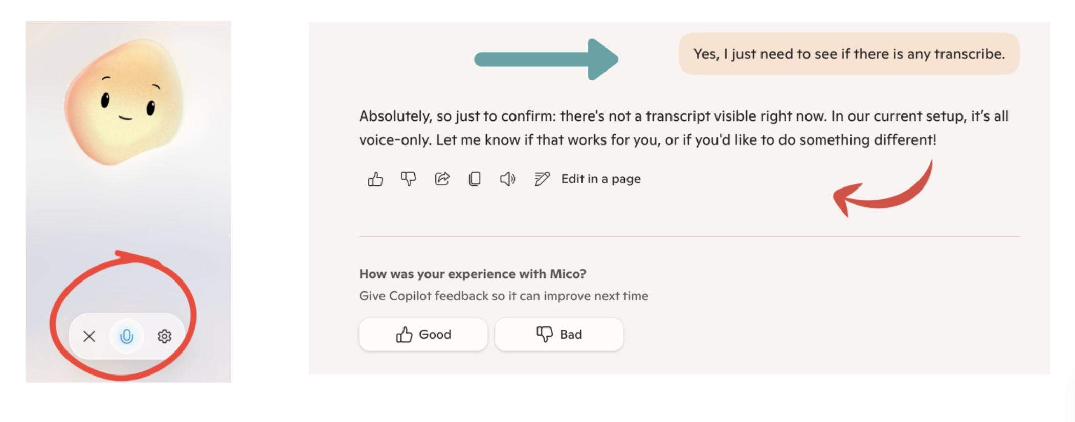
Identified three core UX problems: misleading affordances, poor voice feedback, and weak information scent.
Ideate
Each team member sketched solutions independently, then converged on shared patterns.
Prototype
Built an interactive Figma prototype with redesigned chat bar, waveform, and student sidebar.
Test & Iterate
Each member ran a user study. Feedback led to tooltips, renamed labels, and sidebar highlights.
Final Outcome
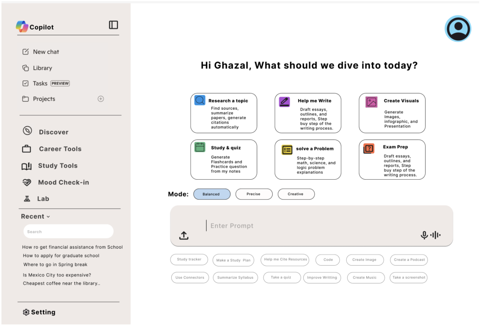
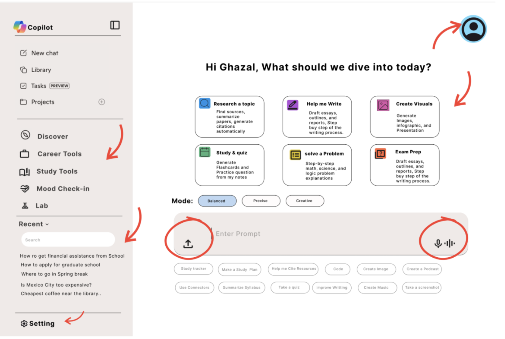
A clearer, student-centered interface
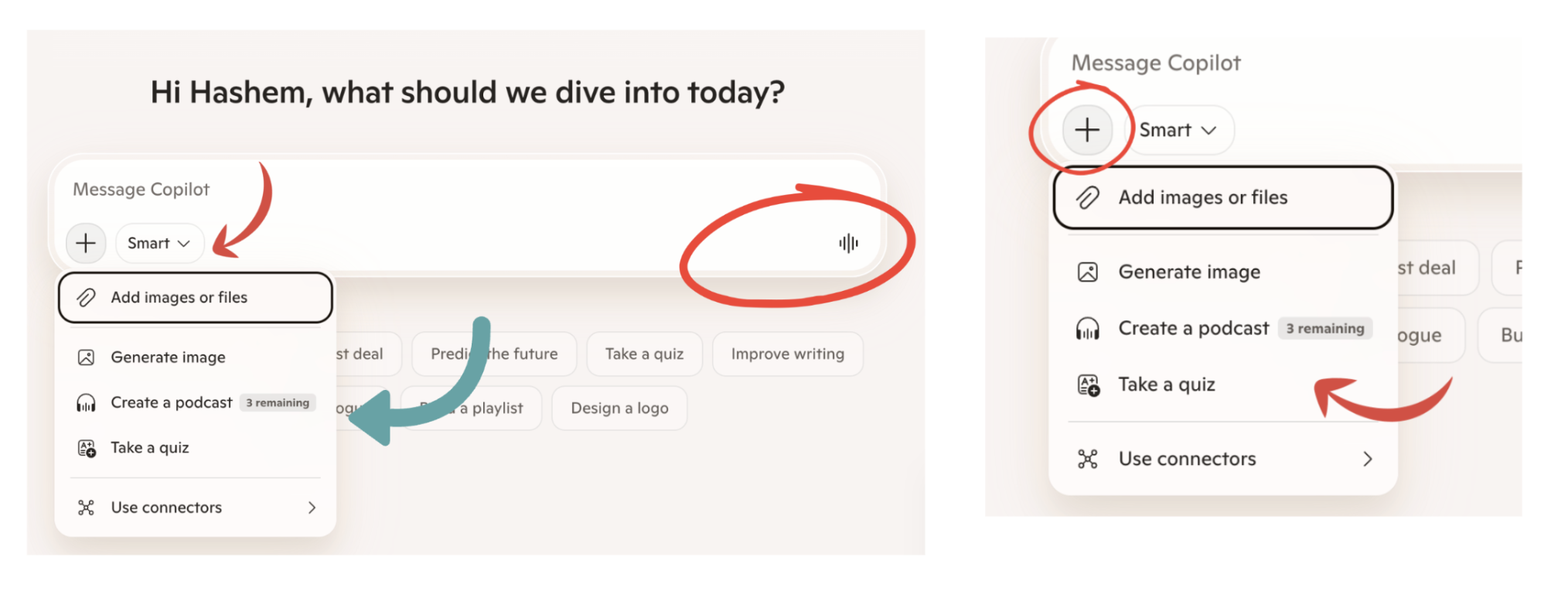
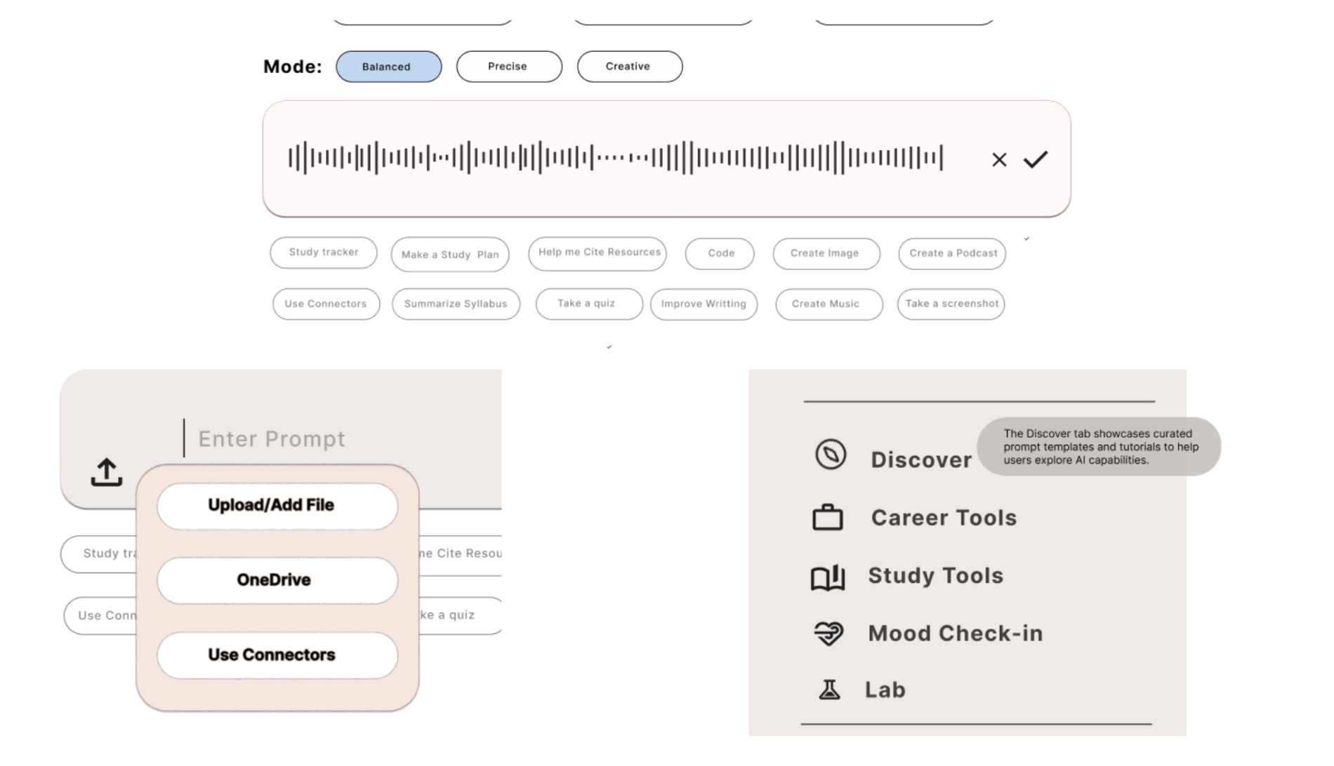
Clear upload button
Dropdown with labeled options: Upload File, OneDrive, Use Connectors
Visible voice input
Mic always in chat bar; live waveform replaces the subtle blue glow
Feature discovery
6 labeled task boxes + prompt chips surface all capabilities upfront
Mode switcher
Balanced, Precise, Creative shown as labeled buttons above the chat bar
Student sidebar
Career Tools, Study Tools, Mood Check-in, Lab replace generic options
Chat search
Search bar under Recent Chats lets users find past conversations quickly
Reflection
What I took away
Convergent thinking is powerful — when a team shares a lived experience with a product, individual sketches naturally align, making convergence faster and more genuine.
Small wording changes matter: renaming "Recent" to "Recent Chats" reduced confusion without any visual redesign.
User testing surfaces blind spots quickly — overlapping icons and missing active-state highlights were things the team hadn't noticed until someone else used the prototype.
Next time: use WhatsApp desktop for easier screen sharing, and test with more diverse users to reduce familiarity bias.