UX Case Study · Fashion E-Commerce · Spring 2026
Designer
Ghazal
Mojtahedi
Project
Zara — Improving Fashion
E-Commerce Navigation
A redesign focused on visibility, feedback, and consistency — maintaining Zara's minimalist identity while fixing three core usability failures.
Skills Demonstrated
Problem Statement
A minimalist site that sacrificed usability
Zara's website is renowned for its editorial aesthetic — but beneath the minimalism lie three significant usability failures: low contrast menus that blend into hero images, no feedback when hovering or interacting, and inconsistent layouts that force users to re-learn interactions on every page.
Redesigned by Ghazal Mojtahedi
Design Process
01
Audit
Analyzed three pages of Zara.com identifying usability failures across visibility, feedback, and consistency.
02
Redesign
Created high-fidelity redesigns improving contrast, adding interactive states, unifying the product grid, and clarifying navigation icons.
03
Evaluate
Verified each redesign decision addressed the original issue while preserving Zara's minimalist brand identity.
Issues & Solutions
Three problems.
Three solutions.
Original — Before
Redesigned — After
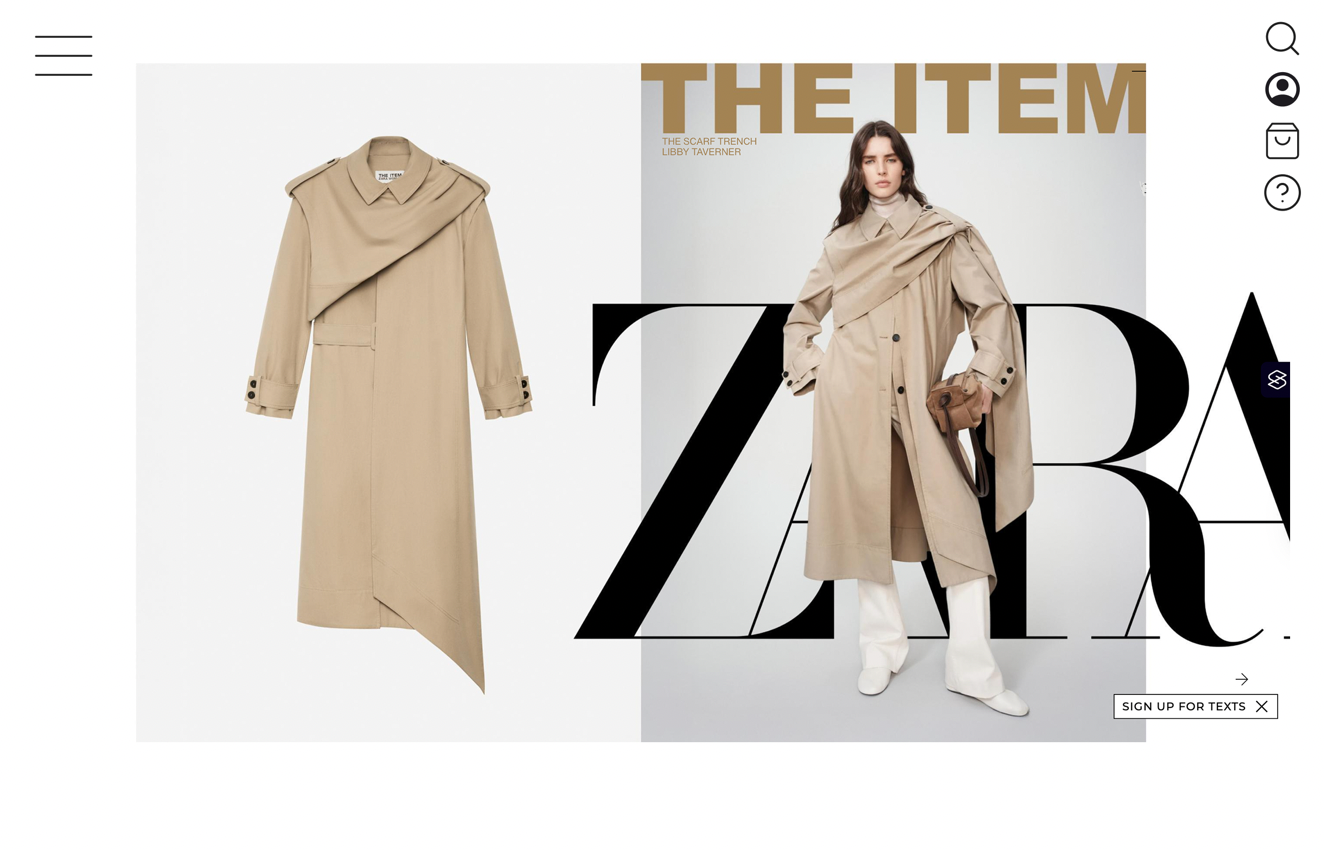
Issue 01 · Visibility & Discoverability
Low contrast menu invisible against hero images
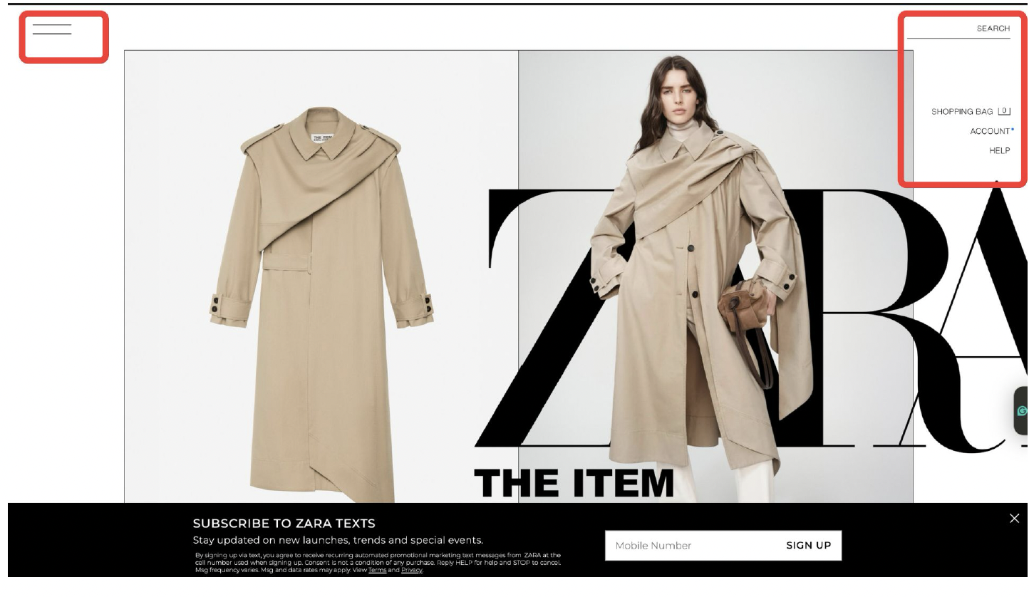
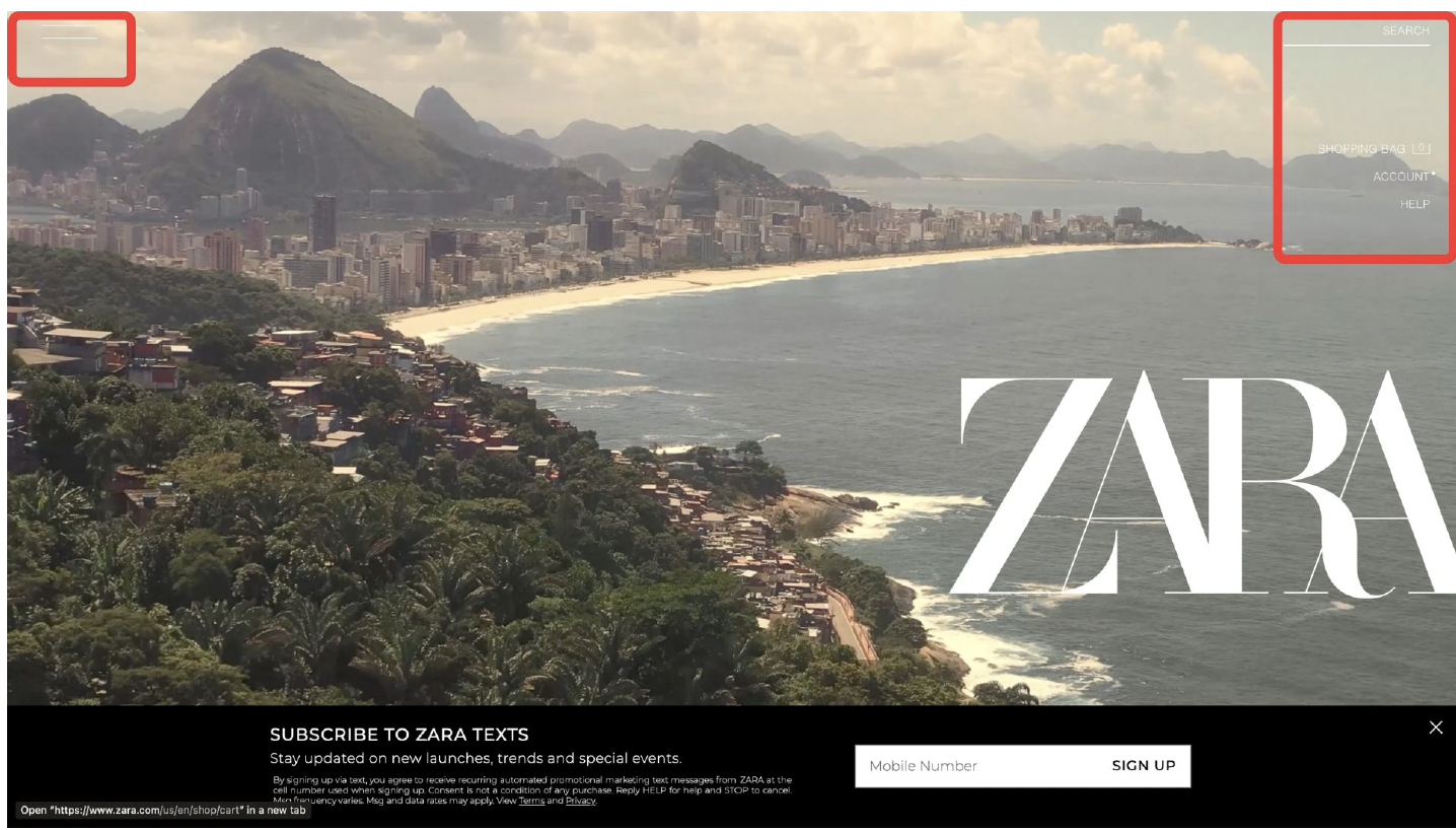
The font is too thin and small. Since images are moving and interactive, their backgrounds make the menu impossible to see. The hamburger icon is unlabeled and too thin. "SEARCH" has no icon — just plain text — failing users with visual impairments.
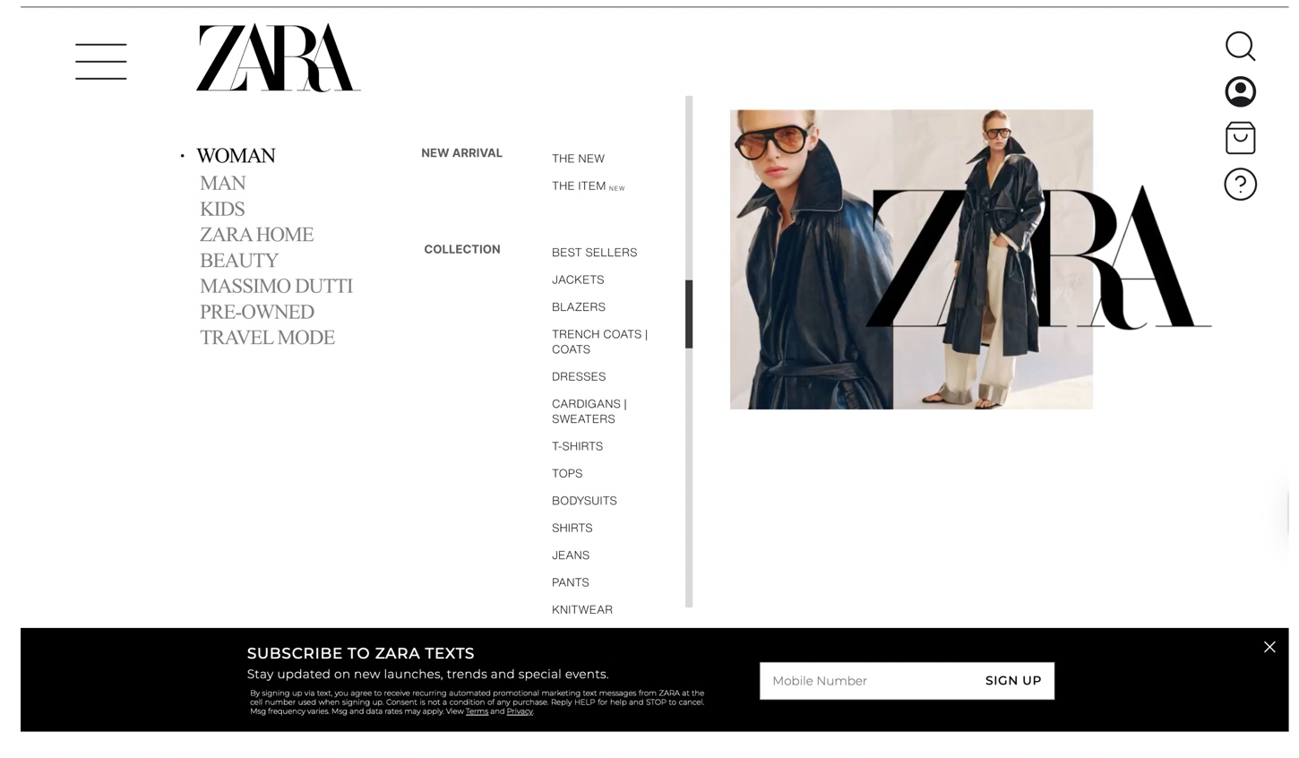
Solution →
Added clearer borders, stronger contrast, and recognizable utility icons — search, account, bag, help — replacing text-only buttons. The hamburger menu is made thicker and visible regardless of hero image background color.
Issue 02 · Feedback
No visual response to user interactions
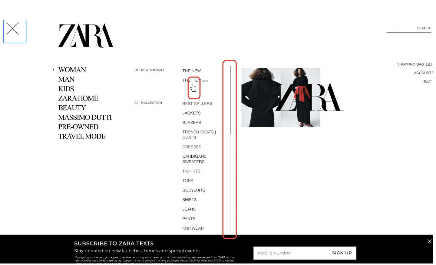
Hovering over menu items changes nothing except a small hand cursor — nothing feels interactive. The scroll bar is too thin and gives no hover feedback. Users can't tell if their action has been registered at all.
Solution →
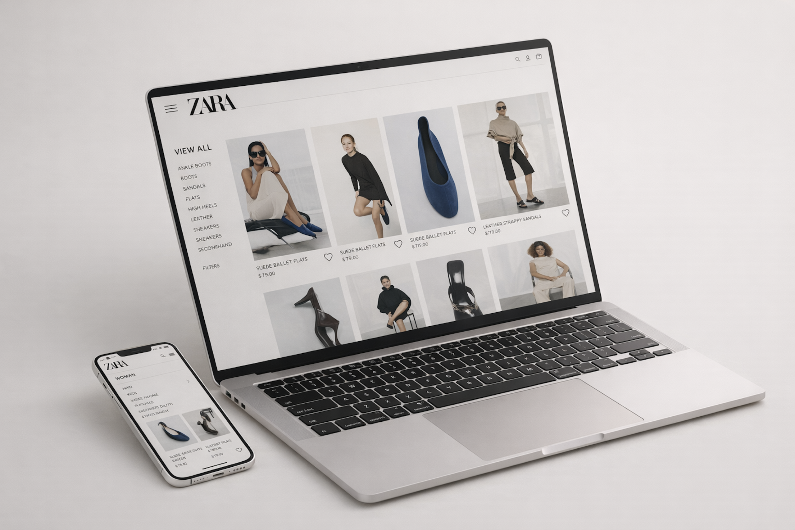
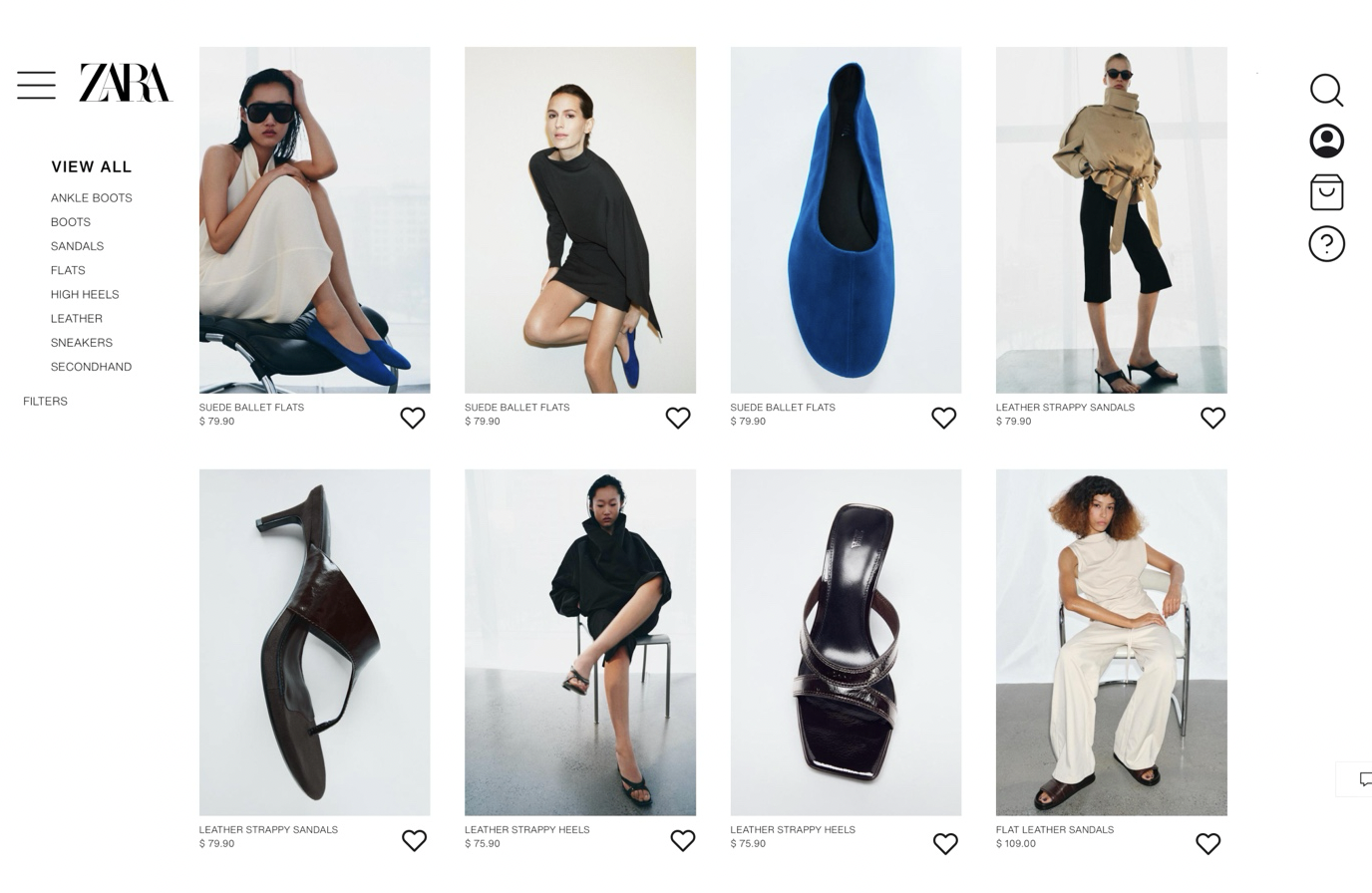
Made the scrollbar more visible. The selected category is now displayed in black while others remain gray — making the active state clear. Collection titles are bolder to signify hierarchy. Image sizes are increased for stronger visual emphasis.
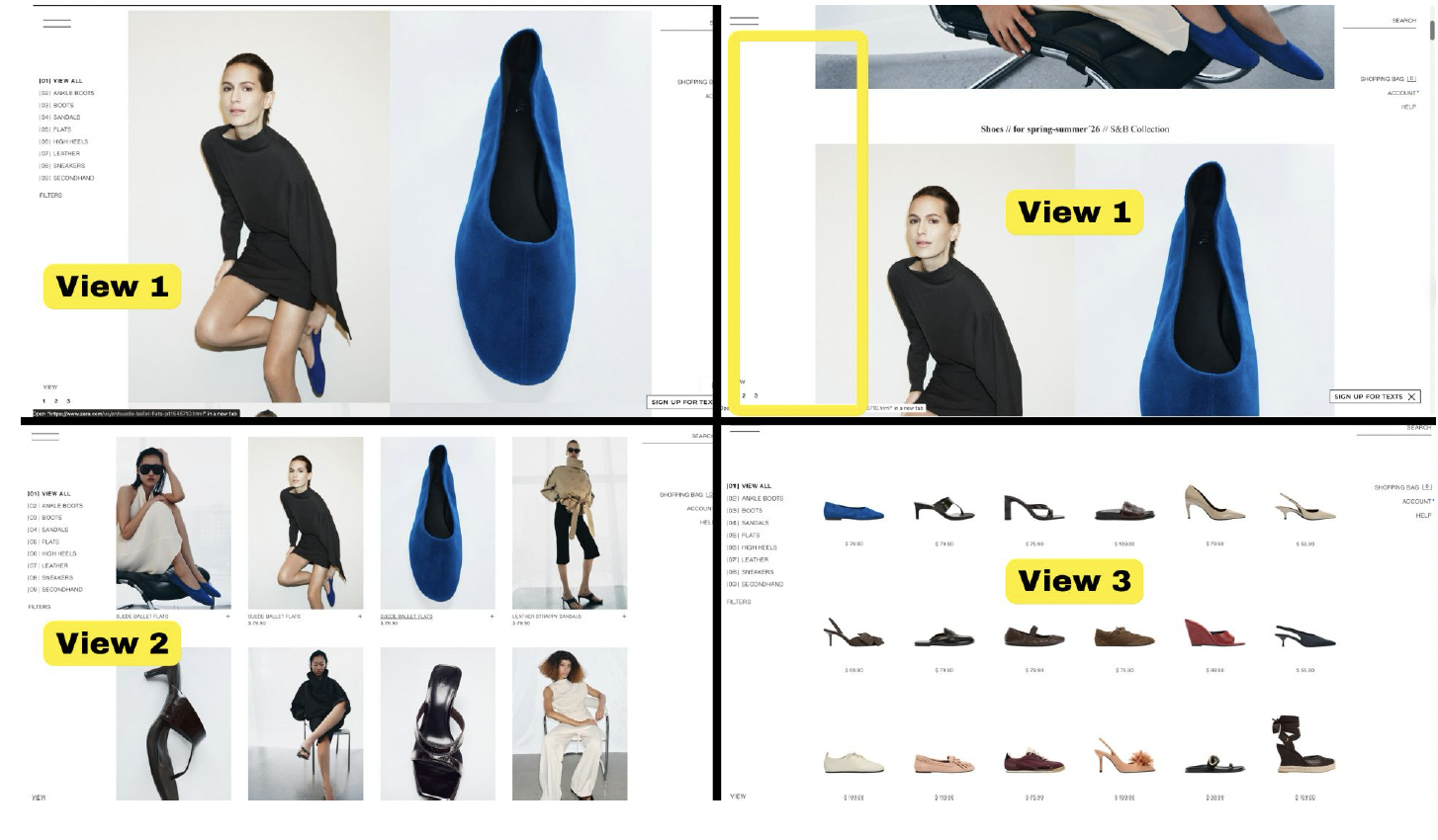
Issue 03 · Consistency & Constraints
Three conflicting layouts force users to re-learn
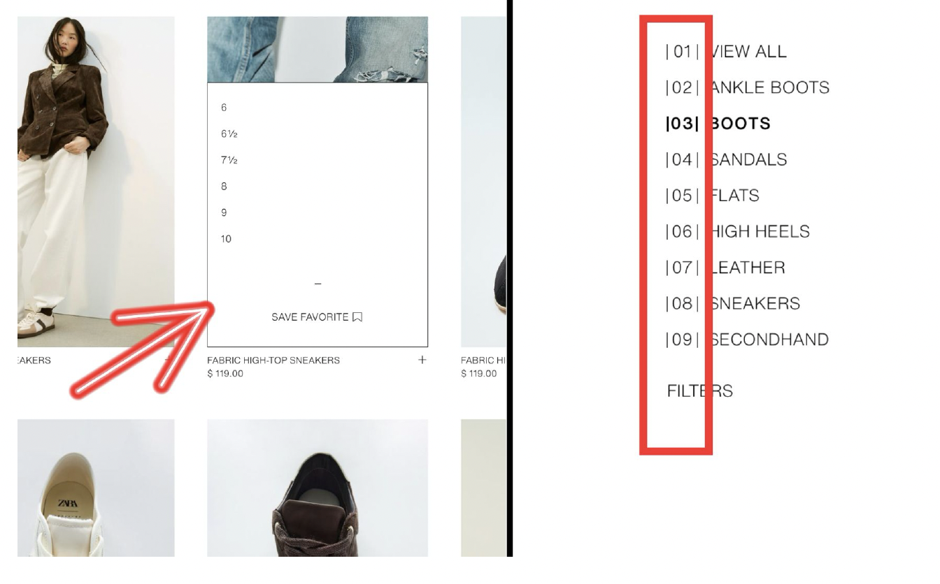
Three view options on the shoes page shift element placement each time — users must re-learn interactions on every switch. The "+" button opens size options instead of adding to cart. Numbered subcategories (01–09) communicate nothing meaningful.
Solution →
Removed three view options — kept one consistent layout. Added the Zara logo to strengthen brand coherence. Replaced numbered subcategories with clear names. Replaced "+" with a heart icon for saving favorites, eliminating the cart confusion.
Reflection
What I took away
Minimalism and usability are not opposites — but they require careful balance. When minimalism removes the signifiers users rely on to navigate, it fails its audience.
Feedback doesn't need to be loud to be effective. Subtle color change on hover or a slightly thicker scrollbar confirm the user's action and build confidence.
Consistency reduces cognitive load more than any single design decision. When layouts shift between views, users spend mental energy re-orienting rather than shopping.
Preserving brand identity while improving usability was the central challenge — every redesign decision had to feel like Zara, not a generic UX fix imposed on a distinctive visual system.