UX Case Study · Visual & Information Design · Spring 2026
Designer
Ghazal
Mojtahedi
Project
Charles Ostman — Redesigning a Futurist's Digital Presence
A redesign addressing five core issues — grid structure, navigation, figure-ground separation, typography, and color accessibility.
Redesigned by Ghazal Mojtahedi
Skills Demonstrated
Problem Statement
A visually chaotic site failing its audience
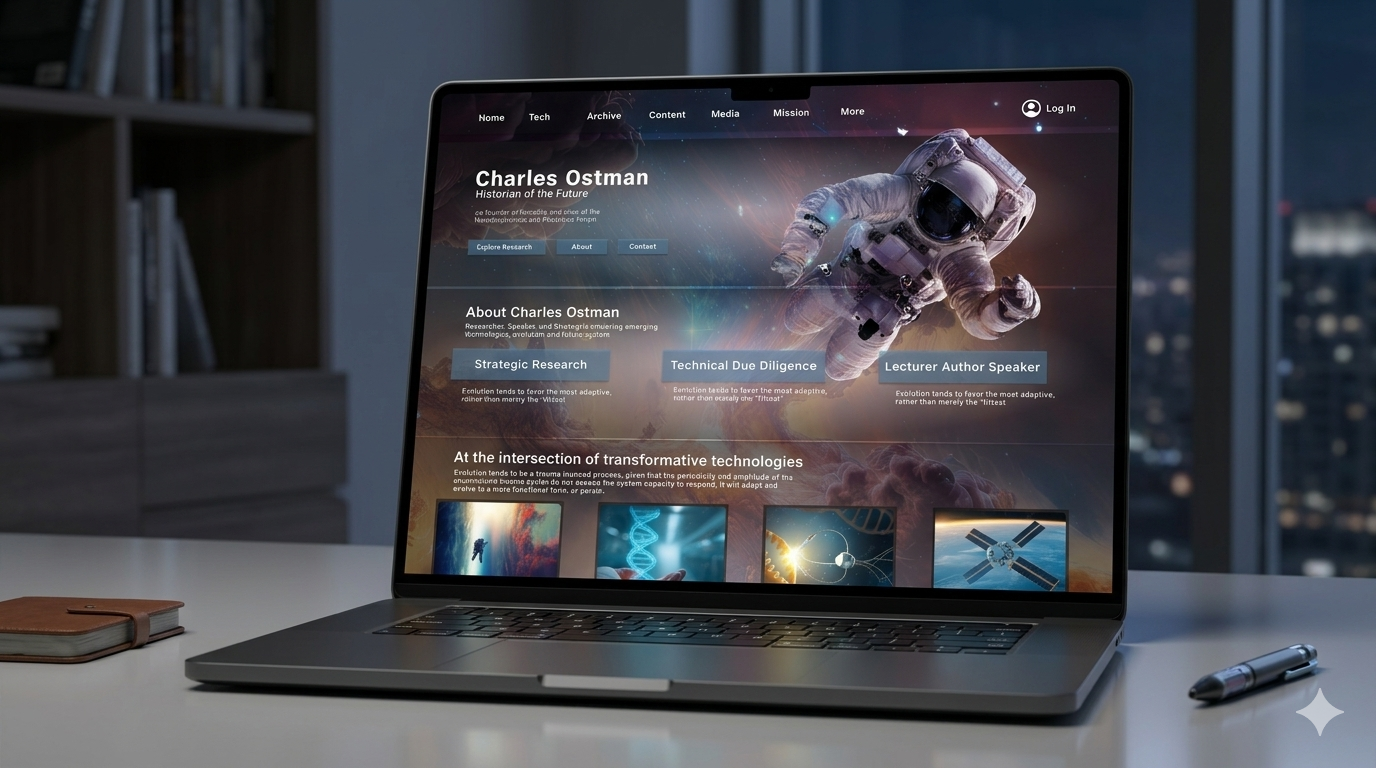
The Charles Ostman website suffered from a complex background overwhelming content, inconsistent typography with no clear hierarchy, highly saturated competing colors reducing accessibility, a broken grid with random element placement, and confusing navigation — all creating a high cognitive load experience that made the site difficult to scan, navigate, and understand.
Design Process
01
Audit
Analyzed the site across grid, navigation, hierarchy, typography, and color to identify friction points.
02
Framework
Applied Gestalt principles and Universal Principles of Design as the theoretical lens.
03
Redesign
Created high-fidelity redesigns for each issue — grid, navigation, figure-ground, typography, color.
04
Evaluate
Tested for color blindness accessibility and compared against originals to verify improvements.
Issues & Solutions
Five problems.
Five solutions.
Original — Before
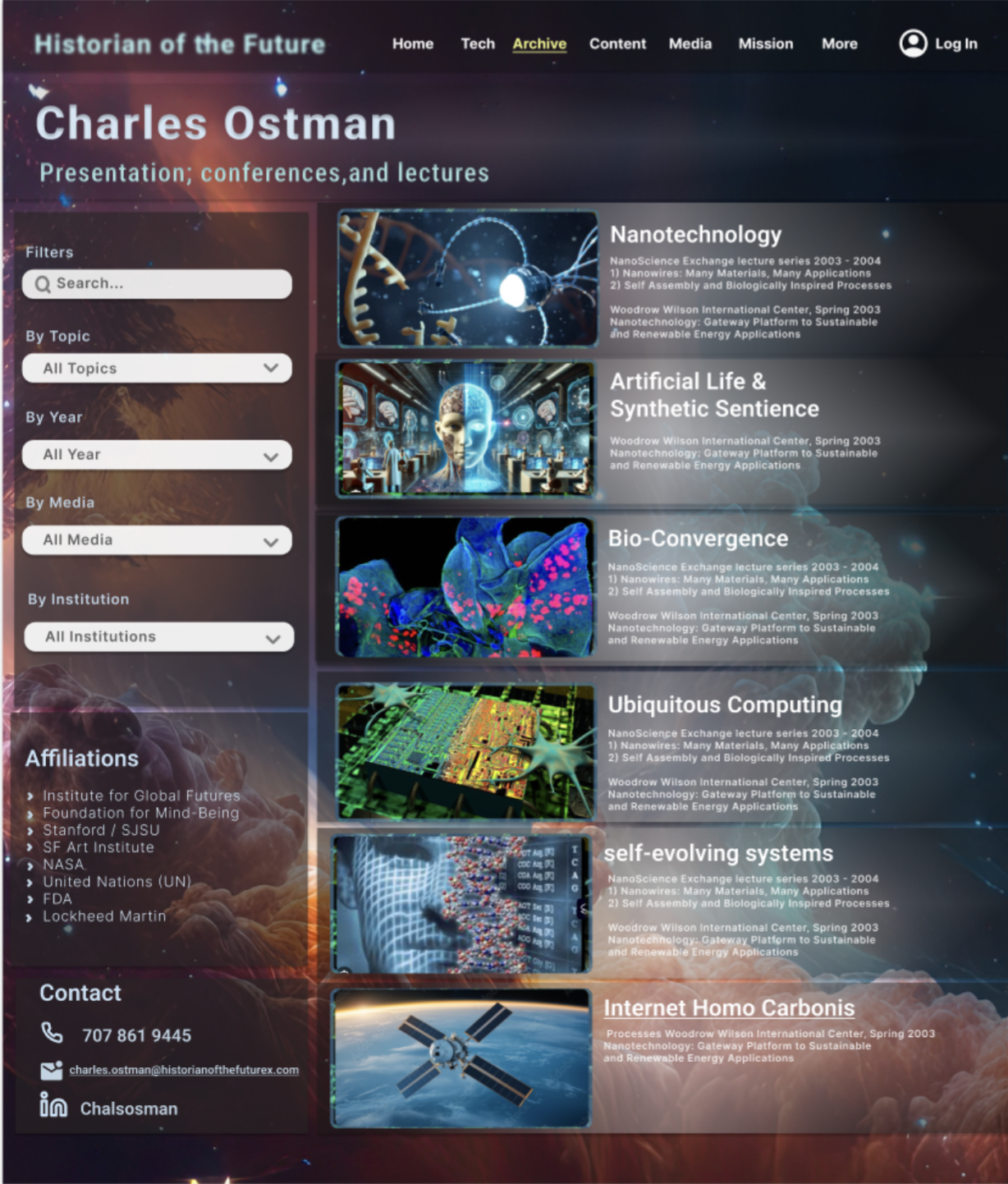
Redesigned — After
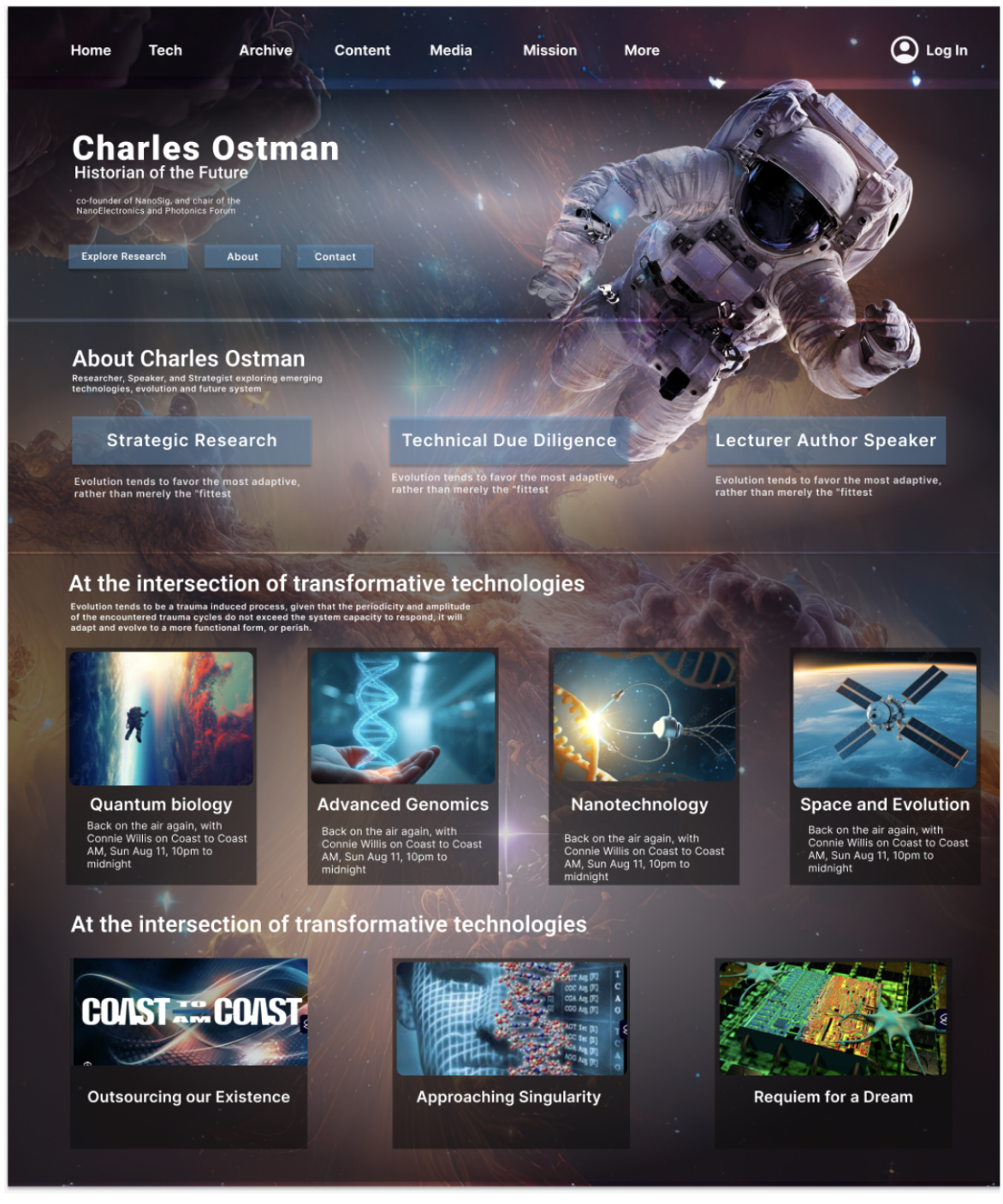
Issue 01 · Grid Structure
No clear grid — random element placement
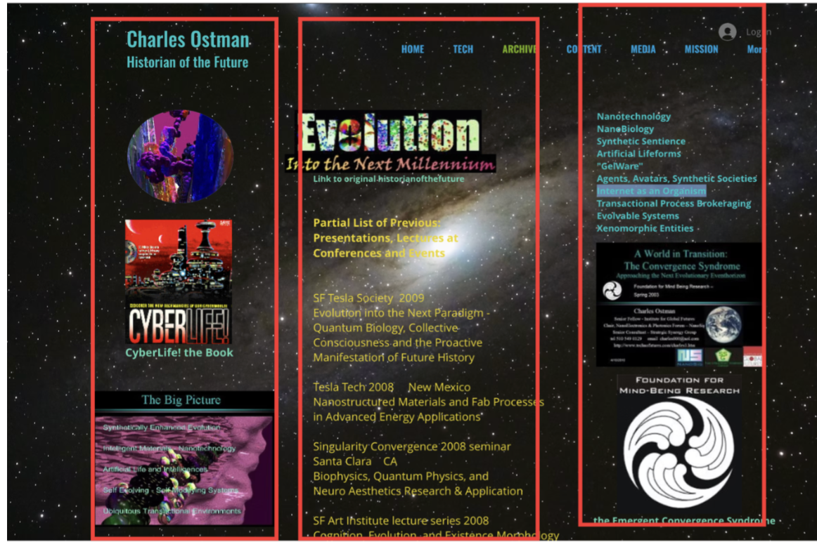
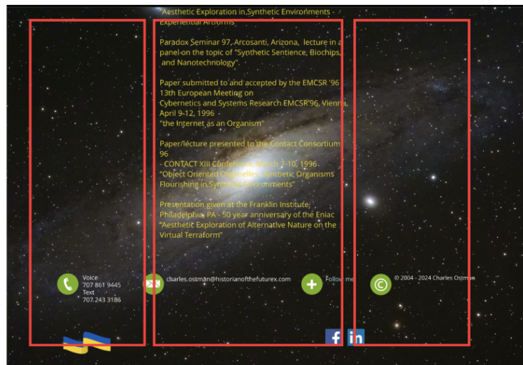
The original appeared to have a three-column layout but alignment was inconsistent. No visual hierarchy made it impossible to distinguish headings from links or content types, increasing cognitive load significantly.
Solution →
Introduced a strict column grid organizing content into clear vertical sections, separating images, text, and media into defined columns — reducing cognitive load and improving scannability.
Issue 02 · Navigation
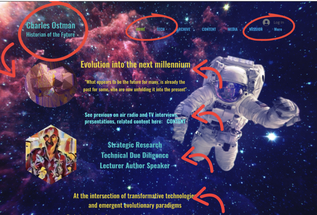
Overwhelming menus with no labels or grouping
Images lacked labels or clickable cues — users couldn't tell if elements were interactive. No content grouping meant users had to guess their way through the archive rather than being guided.
Solution →
Redesigned the archive with search and filtering by topic, media type, year, and institution — aligning with how users expect archive systems to work and making navigation predictable.
Issue 03 · Gestalt · Figure-Ground
Text blends into complex background imagery
The visually dominant background made it impossible to separate content from the ground. High cognitive effort was required just to read the page, directly violating the Gestalt figure-ground principle.
Solution →
Added a darker overlay, organized the layout into structured sections, and increased white space — making it easy for users to differentiate text and interface elements from the background.
Issue 04 · Typography
Multiple competing typefaces with no hierarchy
Inconsistent font styles and too many typefaces made the design feel cluttered. Users couldn't identify the most important information or how to scan the page efficiently.
Solution →
Unified to a single typeface (Roboto) with a consistent weight system — regular, medium, bold — creating a clear hierarchy between headings, subheadings, and body text.
Issue 05 · Color Theory
Saturated competing colors reducing accessibility
Bright blue, yellow, and pink on complex backgrounds weakened hierarchy. Color blindness testing revealed text on images was nearly invisible — a significant accessibility failure.
Solution →
Reduced to a consistent, balanced palette with improved contrast ratios — preserving the futuristic tone of the original while fixing readability and passing color blindness accessibility tests.
Reflection
What I took away
Visual hierarchy isn't decorative — when users can't distinguish headings from body text or content from background, the entire experience breaks down regardless of how interesting the content is.
Gestalt principles gave me a precise vocabulary for explaining why certain designs feel confusing — the figure-ground problem here wasn't just "hard to read" but a specific cognitive failure that could be fixed systematically.
Color accessibility testing revealed problems invisible to most users — designing for color blindness made the redesign better for everyone, not just those with visual impairments.
Preserving the original tone while improving usability was the hardest balance — the futuristic aesthetic was core to Ostman's identity, so the redesign had to feel like an evolution, not a replacement.
More Case Studies
Let's work together